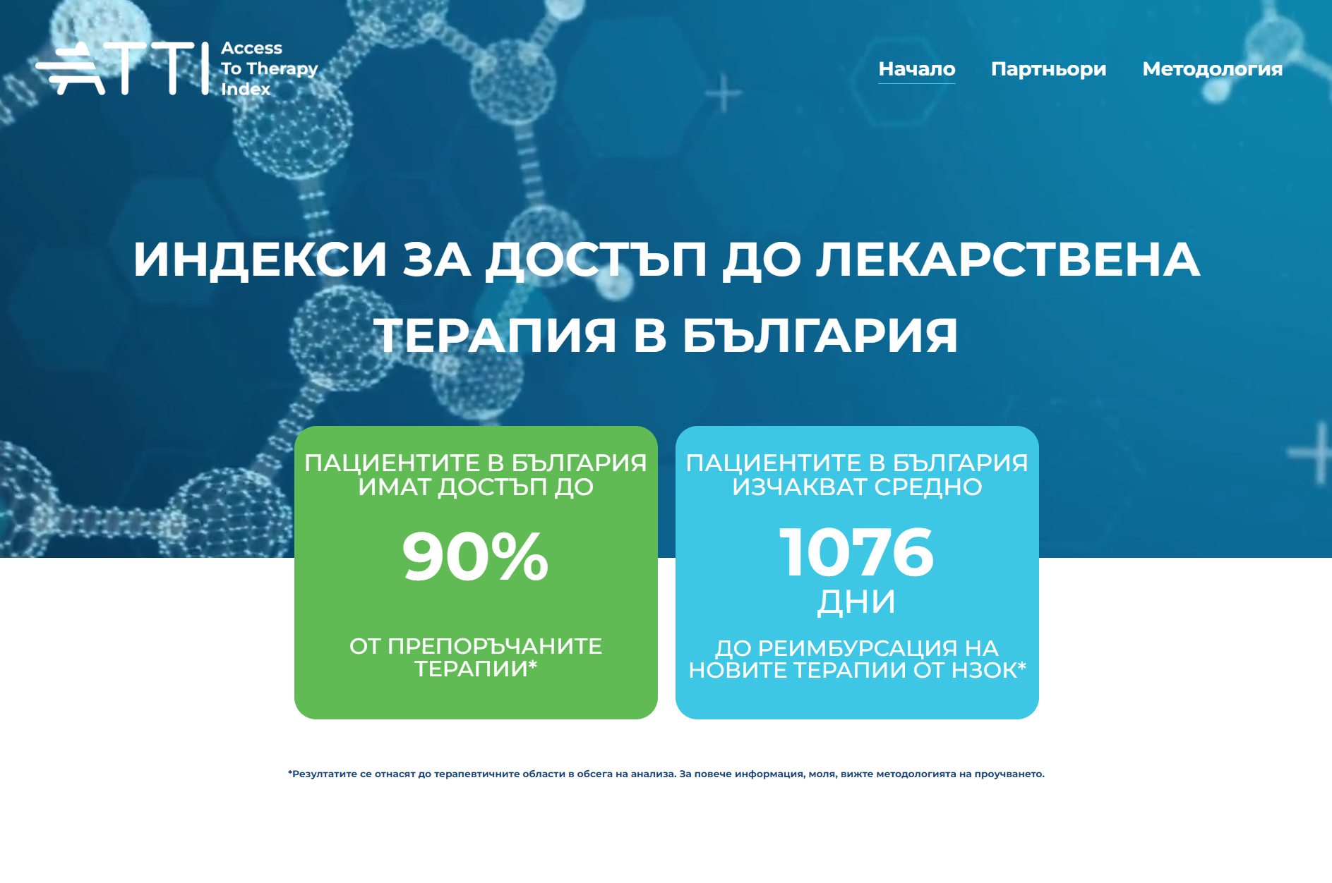
Making Invisible Data Visible: The ATTI BG Access to Therapy Index
Cancer patients in Bulgaria face two distinct problems when accessing the therapies they need. The first is whether a therapy is available at all — whether it has been approved for reimbursement by the National Health Fund. The second is how long they have to wait for it.
Both problems were known. Neither was measured in a way that made the data accessible to policymakers, patient advocacy organizations, or the public.
ATTI Bulgaria — the Access to Therapy Index initiative — was commissioned to change that. The brief was to build a platform that could calculate, visualize, and communicate two specific indices across multiple cancer types and multiple years. The data would come from the client. The analytics, the applications, and the website would be built from scratch.
What Was Built
The ANIGO Index — Access
The ANIGO index measures what percentage of cancer therapies recommended by the European Society for Medical Oncology (ESMO) are reimbursed by the Bulgarian National Health Fund (NHIF) for treatment of Bulgarian citizens.
The application allows users to filter by cancer type — breast carcinoma, lung carcinoma, prostate carcinoma — and view access rates by year (2020–2023) and by cancer localisation. The overall figure at the time of publication: 90% of recommended therapies were accessible.
The ANEMO Index — Waiting Time
The ANEMO index measures the time from EMA marketing authorisation to the date a therapy is effectively available to Bulgarian patients through NHIF reimbursement. It tracks the gap between when Europe approves a drug and when a Bulgarian patient can actually receive it.
The application allows filtering by index type, cancer type, and year. The average waiting time at the time of publication: 1,076 days — nearly three years from EMA approval to patient access. Broken down by cancer type: 811 days for breast carcinoma, 1,015 days for lung carcinoma, 1,488 days for prostate carcinoma.
The Website
Both applications were embedded in a purpose-built website with a methodology section explaining how the indices were calculated, a partners section crediting the commissioning organizations, and a bilingual design for accessibility across stakeholder audiences.
The Technical Work
Both Plotly applications were built entirely from scratch in Python — no template, no existing platform. The analytics methodology was designed and implemented based on the data provided by the client: defining what to measure, how to calculate it, how to handle edge cases, and how to present the results in a way that was both accurate and accessible to a non-specialist audience.
Interactive features included dropdown menus for cancer type and index type selection, year-by-year bar chart visualizations, localization breakdowns, and large-format summary figures designed to communicate the headline numbers immediately.